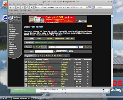
One of the things that I've always wished for is a colour managed web browser for my Windows machine. I normally use Apples for my critical colour work but have a PC Laptop that I often do less critical work on like this blog or uploading to Pbase.
Enter Safari Beta, the same browser I use (and have become accustomed to on my Mac) and my preferred browser for most sites.
Apple obviously didn't want to use the Windows GUI Safari looks very similar to its Mac version, so much so that the scroll bar is blue Aqua like in OS X.
Performance is decent, so far no big gotcha has surfaced and although its too early to recommend this browser on performance as it obviously has one or two glitches, but in the couple of days I've been using it not one crash so far...
None of the above is any reason to use it as a web browser though as Firefox pretty much does all it can do page rendering wise, so why use Safari?
Colour Management
Safari is the first ICC aware browser for the PC, that is it is the only browser that currently can display an embedded profile.
If you would like to know more Jeffrey Friedl has an explanation on his
blog.Here is a graphic illustration of the difference between the way Firefox and Safari display colour:
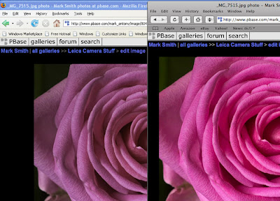
The image above is a clear demonstation of how 'unaware' browsers send colour straight to the video adapter and why colour management is important, hopefully both Firefox and IE developers will give us ICC aware versions soon!
Page and Text Rendering
Text rendering in Safari is very different also, I know that this is personal preference as some will feel Apples font engine gives 'blurry' text, while others will like the accuracy of the font rendering (I fall into the latter group) and find the letterforms less tiring to read:
Here is a page in both IE and Safari as a comparison:
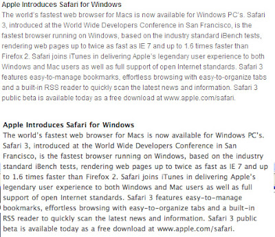
The Safari version is the lower one, and although the fonts are heavier and slightly less distinct I find the sharper text harder to read, although I understand why some prefer the sharper version.
Here is an actual web page so you see how page elements and text render:

If you click on the image you'll see a full size version that shows why some think Safari has blurred text.
To Sum upI like Safari on the whole, Apple have done a good job in making the browser ICC aware, although some will not like the font rendering. I have only been using the browser for around two days at time of writing and it has yet to crash/freeze, but the little bug button (to report problems to Apple) in the address bar is a reminder that this is Beta software.
I actually like its uncluttered interface but this could just be because I'm used to it on my Macs, although I've noted that there has been a lot of negative comments on internet forums about its 'ugly' looks for me beauty is in the eye of the ICC aware photo viewer ;-)
All text and Images © Mark Antony Smith
 One of the things that I've always wished for is a colour managed web browser for my Windows machine. I normally use Apples for my critical colour work but have a PC Laptop that I often do less critical work on like this blog or uploading to Pbase.
 The image above is a clear demonstation of how 'unaware' browsers send colour straight to the video adapter and why colour management is important, hopefully both Firefox and IE developers will give us ICC aware versions soon!
 The Safari version is the lower one, and although the fonts are heavier and slightly less distinct I find the sharper text harder to read, although I understand why some prefer the sharper version.
