Saturday, 21 June 2008

Resetting Photoshop dialog boxes

This is more of a tip than a tutorial, but one that will save you time.
Often when working in Levels or Curves and sometimes other photoshop dialogue boxes like Shadow/Highlight its easy sometimes to go a little too far with your corrections. The option for most people is to move all the sliders or nodes back to their defaults which is easy with levels or colour correction, much harder with Shadow/highlight and curves.
Most people just press the cancel button, but wait... don't do that! did you know there is a hidden 'reset' button?
If you press the alt button the cancel button turns into a reset button like this:


So don't cancel - Reset

Monday, 26 May 2008

Bayer Basics

I recently found a link to Marc Rochkind's blog where he has a downloadable program that allows you to open up a NEF (Nikon Raw) file and see the image as a Bayer CFA before the interpolation and image processing has taken place.
If you want you can download the application free on Marc's blog and if you don't have Nikon he includes a NEF for you to play with.
I should also note that this is a Mac only app.
Very neat and interesting...

Saturday, 17 November 2007

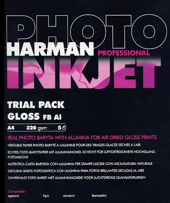
Harman Glossy FB Baryta inkjet Paper


When I first read about this paper I became very exited, Harman are basically the same outfit as Ilford, and I believe that the paper base for their FB Baryta range is similar to the fiber based traditional papers like Ilford Galerie which I and other photographers have been using for years.
Photographers who have become accustomed to printing their works on high quality Silver FB materials over the years would obviously like to have an equivalent ink-jet paper, with the deep blacks, surface and luminosity (glow) that is associated with the best traditional papers.
Harman on specification seem to have delivered with their 'Baryta' based FB range boasting:
"Real baryta paper with the look and feel of traditional photographic paper"
Quite a boast, could this paper be the one that finally puts ink-jet in the same ballpark as my wet darkroom prints?
320gsm, Baryta, Fiber based paper could this be the paper we have been waiting for?
First observations is that this paper is expensive, at well over £1.00 per sheet, so cost wise it is up with the price of the likes Museo Silver rag and the Hahnemühle papers.
The paper itself is quite shiny with a lot smoother surface than a traditional fibre based paper, it also has a very bright white base compared to some papers I have used.
Another thing you notice is that the paper smells similar to conventional silver photo paper, a kind of sharp acidic smell quite reminiscent of the wet darkroom papers.
In order to test the paper I downloaded the latest profiles from Harmans website, this involved having to register with e-mail and password.
The paper transport seemed quite problematic with my Epson R2400 several attempts were made to print on my glossy media setting all of which resulted in jamming, in fact the only way I could get the test through was to use semi-matt media settings.
Once I'd managed to get the paper transporting OK the resulting printed image looked fine, I'm sure once I have my own profile the colours/density will be even better but the canned factory profiles acceptable for most users.
The paper obviously has a very good D-max coupled with a bright white (I'd prefer creamier) base that gives the printed images quite a bit of 'pop' looking crisp and detailed, possibly this is due to the gloss Alumina coating used.
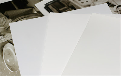
Above is a picture of 3 glossy papers, on the left is Fuji Multijet which to my eyes has a slightly cyan/blue tinge and the highest gloss of the three. Centre is the Harman which is the brightest white and slightly less glossy. Right is the Fotospeed EG which is duller and 'waxy' with a more paper like look.

So what do I think about the new Harman paper? Well truthfully I'm disappointed, not that this is a bad paper (far from it) but rather because this paper promised to be similar to silver based baryta papers – it isn't.
Harmans baryta inkjet paper has several crucial differences between the results it delivers and a print on say Agfa Record Rapid or even Ilfords own great darkroom paper Galerie.
The surface is far too glossy for my taste, certainly more than say my reference Fotospeed paper, this leads the inexperienced worker to feel it gives sharper results (it doesn't) in truth I found the surface to be similar to Fuji glossy paper not perfectly glossy, with a slight 'tooth' but certainly much smoother than 'real' silver based paper.
If you tilt the paper to the light you can clearly see the highlights and a small amount of 'gloss differential' nothing objectionable but you can see it if you look at an angle, but it's certainly no worse than other glossy papers with the Epson R2400.

I realise that the above doesn't sound like a ringing endorsement, and that may partly be down to my unrealistic expectations that this paper was going to give me similar results to traditional papers, and if producing prints that equal your 20 year old Ilfobrom prints in all respects is your goal then I think you'll be disappointed.

If you are just looking for a high quality modern inkjet paper, and don't expect it to mimic the past glories of silver printing then you may well love this paper.
My advice is to purchase a trial pack, give it a try. But personally it wasn't my cup of tea and I hope that Ilford (sorry Harman) will take another look at this paper (try actually placing it against some prints made on wet darkroom paper) and produce a MK II that will have a nicer more traditional FB less glossy surface.

Wednesday, 29 August 2007

Moiré Removal in Photoshop

One of the most disconcerting things especially for wedding or product photographers is the moiré pattern.
I'm not going to explain why it occurs, but further info is here should you need it.

What i am going to show you is my method for its removal.
Here is the problem photo courtesy of John B. Griffith


image © John B.Griffith

Problems like the one above look to be beyond saving, but all is not lost.

Firstly convert image into Lab colour space– image>mode>Lab Colour.
Then duplicate the layer so that you are working on a copy– Layer>Duplicate Layer.
Next select the area with the moiré with your usual selection method.
If you then select the b channel in the channel palette you will see the problem noise:


The noise is clearly visible in the b channel, also if you check the L (luminance) channel it has an identical pattern.


Most people who work in Photoshop L*a*b mode to remove moiré just blur the a and b and we can do that too but
normally when people see noise in the L channel they believe the image to be beyond saving as the luminance channel has been damaged.

So what we are going to do is use the 'Apply Image' command in the image menu to use the noise in the b channel to knock out the noise in the L channel as below.


As you can see the L channel has lost the noise, varying the opacity will further enhance the effect 60% was chosen here.
Here is a close-up of the settings in the Apply Image command.


The important settings are that the 'Invert' box is ticked the b channel is selected the target is the L blending is normally Hard light or Soft Light and the opacity is varied to cancel out the noise.
Finally you must then go into the a and b channels and apply Gaussian Blur until no detail can be seen.
And here is the result


Not perfect, but playing with the opacity and blend mode will yield even better results, and certainly better than could be expected from most other methods.

I would like to than John B. Griffith for making this shot available the picture is his copyright, please respect that.

all words and text © Mark Antony Smith

Wednesday, 11 July 2007

Harman Inkjet Baryta Photo Paper


Harman Technology was formed by 6 former managers of Ilford, and is named after Ilfords founder Alfred Hugh Harman.
Why is this of interest to me? Well they have just introduced a range of papers that have a Baryta base just like the Fibre based papers used by professional photographers and art printers for over 50 years, here's their Blurb:

"HARMAN PHOTO Professional Inkjet Paper has been developed using state-of-the-art photo imaging and paper base technology.
The real photo baryta base gives true photographic weight and feel to the paper. The imaging technology behind the paper has been extensively researched and the formulation gives an outstanding image quality in terms of extensive colour gamut, greater detail and definition, excellent tones and archival permanence properties.
The specially developed anti-curl system ensures the prints remain flat after printing.
Designed for digital fine art printing, HARMAN PHOTO Professional Inkjet Paper is of exhibition and museum quality. The perfect media for limited editions of giclee prints or archival prints. Products currently in the range are MATT FB Mp and MATT FB Mp WARMTONE. July will see the launch of an air-dried Gloss version.
The paper is designed for use on all leading pigment and dye based ink printers".


Sounds good to me, as I've been looking for a fine art printing paper for my Epson R2400 and although at time of writing I can only get my hands on the Matt version, as soon as the glossy one comes out I'll be sure to give it a try- test report to follow.

Friday, 15 June 2007

Still Raining

England, Summer, flaming June no less!
So another Macro rain drop shot.

Hoping for a Sunny Week-end
All text and images © Mark Antony Smith

Thursday, 14 June 2007

Safari for Windows

One of the things that I've always wished for is a colour managed web browser for my Windows machine. I normally use Apples for my critical colour work but have a PC Laptop that I often do less critical work on like this blog or uploading to Pbase.
Enter Safari Beta, the same browser I use (and have become accustomed to on my Mac) and my preferred browser for most sites.
Apple obviously didn't want to use the Windows GUI Safari looks very similar to its Mac version, so much so that the scroll bar is blue Aqua like in OS X.
Performance is decent, so far no big gotcha has surfaced and although its too early to recommend this browser on performance as it obviously has one or two glitches, but in the couple of days I've been using it not one crash so far...
None of the above is any reason to use it as a web browser though as Firefox pretty much does all it can do page rendering wise, so why use Safari?
Colour Management
Safari is the first ICC aware browser for the PC, that is it is the only browser that currently can display an embedded profile.
If you would like to know more Jeffrey Friedl has an explanation on his blog.
Here is a graphic illustration of the difference between the way Firefox and Safari display colour:

The image above is a clear demonstation of how 'unaware' browsers send colour straight to the video adapter and why colour management is important, hopefully both Firefox and IE developers will give us ICC aware versions soon!
Page and Text Rendering
Text rendering in Safari is very different also, I know that this is personal preference as some will feel Apples font engine gives 'blurry' text, while others will like the accuracy of the font rendering (I fall into the latter group) and find the letterforms less tiring to read:
Here is a page in both IE and Safari as a comparison:

The Safari version is the lower one, and although the fonts are heavier and slightly less distinct I find the sharper text harder to read, although I understand why some prefer the sharper version.
Here is an actual web page so you see how page elements and text render:


If you click on the image you'll see a full size version that shows why some think Safari has blurred text.
To Sum up
I like Safari on the whole, Apple have done a good job in making the browser ICC aware, although some will not like the font rendering. I have only been using the browser for around two days at time of writing and it has yet to crash/freeze, but the little bug button (to report problems to Apple) in the address bar is a reminder that this is Beta software.
I actually like its uncluttered interface but this could just be because I'm used to it on my Macs, although I've noted that there has been a lot of negative comments on internet forums about its 'ugly' looks for me beauty is in the eye of the ICC aware photo viewer ;-)
 
All text and Images © Mark Antony Smith